It’s finally time for the beta, which means things are mostly done and stabilization is now the highest priority.
Go download it at the forum, or get it via the built-in updater from any Paint.NET version. Make sure “Also check for pre-release versions” is enabled – you can ensure this by first clicking Check for Updates (from the Help or Utilities menus), then clicking the Options button.
This beta is the first to include the newly refreshed user interface, with new icons and enhancements for Aero and “glass” (Windows 7 and Vista only). Here’s a taste of that:
(Click for full-size version.)

You can get the full changelist over at the forum.
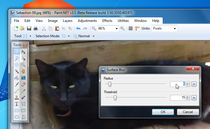
In addition to the glass in the image thumbnail list, I have added it to the footer of many dialogs. This includes the setup wizard, and dialogs for File->New, Image->Resize, Image->Canvas Size, Choose Tool Defaults, Save Configuration, Layer Properties, Rotate/Zoom, all IndirectUI-based effects (both built-in and plugins), and Help->About.
Here’s a little preview of that:
(Click for full-size image.)
Please note that if you are using the “Windows Classic” theme, or if you are running Windows XP, then Paint.NET v3.5 will look mostly the same as Paint.NET v3.36.
Also, there are some languages for which the “glass footers” will not be enabled. These include Japanese, Chinese, and Korean. The reason for this is purely technical – the text for the buttons does not render correctly. It appears that GDI+ is actually passing through to GDI when rendering those glyphs, and that causes the alpha channel to be overwritten and the text is illegible.

Wow, exciting! Downloading right now … can’t wait to try it out! Thanks for the awesome work 🙂
Thank You for Russian Translate! It’S SUPA GOOD!
wow, i don’t what to say, THANKS
Glass around OK/Cancel buttons doesn’t seem like a common UI pattern. Are you sure the glass helps the UX in this case?
Hi!
I’ve been enjoying using the alpha (which was remarkably stable), and installed the beta this morning.
A couple of comments on the glass. I like it in the top border, it looks smart and quite distinctive (echoing some of the look of the ribbon, without actually changing the interaction metaphor; which will be a big step).
On the other hand, I really don’t like the use of the glass on the dialogs. I’ve played with that before myself, and it tends to divorce the buttons from the interaction pane, causing just a moment of cognitive dissonance every time you want to action your work; over a long period, that feels quite tiring.
I think this is because the dialog (modal or modeless) is designed to pop up over an existing surface, and so its real estate needs to be clearly bounded, or it starts to get messy.
On the other hand, you can have control-regions that manifest over the work surface itself, smoothly blended in and without those clear boundaries (the interactive elements bound themselves); but that is very difficult to achieve in a WinForms-environment: you need something like the control composition that WPF provides.
Anyway, hope that feedback is useful. Still loving your work!
And, in fact, just off to PayPal for a spot of donation….
i was thinking, since there is a change in visuals, maybe new main icon will make it a real refresh, just thinking, thanks
Borek and Matthew, re: glass dialog footers. Personally I like it, but I’m not married to it. It’s hard to say at this point whether it’s simply unconventional, or if it’s “bad”. I ask that you use it for a week and then report back on what you think at that point. With that in mind, I’m not trying to imply that I believe you will or will not like it better at that point. That’s for you to decide. I don’t have a week’s worth of data myself, yet.
Matthew, as for the donation, thanks! 🙂
Dakn, probably not. Definitely not anything major, that’s for sure. If anything, it would simply get some light touch-ups to make sure the border matched with the rest of the UI icons.
Are you using glass with .net winforms?
If so, how did get it to work?
The hacks i found using a transparent panel and the form’s transparent key is not satisfying since clicking on the glass gives the focus to the window under.
Or did you reimplement a serious part a the Form class to deal with things like that?
I’m missing a function to zoom in and out by pressing the keys “+” and “-“… Pressing both could use the default view…
Lars, perhaps you want Ctrl + and Ctrl – … ?
@Zarathoustra: I added glass to my UploadTo plugin using P/Invokes.
http://www.danielmoth.com/Blog/2006/06/vista-glass-in-c_17.html
As you know, im a great supporter of your work. And you’ve done it yet again, BRILLIANT.
1) I prefer it without 1 px offset, but that’s preference more than anything else.
2)Can you please point your big Paint.net icon to be used in programs and features too, as were working on looks with this release 😀 See:
http://i669.photobucket.com/albums/vv57/DanTonyBrown/IconBiggerPleaseRICK.png?t=1253554827
3) I have a few ideas for jump lists if your interested? : New image and Open most recent
4) This is a bloody brilliant release. Be proud 😀
Cheers,
Danny.
Dan, that’s weird. It used to have the 256x icon in Programs/Features … what happened! Trolling through the registry seems to indicate that it is doing something weird with respect to icon extraction. Bug filed — it’s low priority though.
Hmm, for me its been like it for months mate, though I imagine you don’t look at it too much to notice 😛
I didn’t mention it before cos all the previous releases were more tech based than UI. I wish all the devs were as good as you regarding the little things, they dont help my OCD 😛
Glad i could help, even a little.
Dan.
(I’m the first Matthew that commented on this post 😉 ) I really like the glass in the dialog footers; it looks really nice IMO. If you can get origional content (instead of just the default “Recent Files,” pin, and close buttons) in the jumplists would be nice too! Thanks again for a great program … it looks beautiful!
is it me or is that a ribbon inspired file menu?
8675309, I don’t know what you mean. The color scheme is inspired by the newest iteration of Paint in Win7. Maybe that’s what you’re noticing.
I honestly don’t like the glass in the footer of dialogs at all… it’s not a common UI pattern
I found a bug.
(don’t know if it’s already known).
For repro:
1) run an app that makes vista disable glass automatically because of this apps.
2) run paint.net and notice it doesn’t have glass
3) close the guilty app (causing glass to be enabled again in windows)
4) notice the the piece of glass after menu items (right of help menu item) remains black.
OS: vista SP2
PS: i think he ment the menu is inspired from the office ribbon.
Fantastic release–I daresay your best work yet. Thanks for all your tireless efforts, Rick.
That’s a beautiful release Rick. The glass in the toolbar looks great. The whole menu + toolbar area is very reminiscent of a ribbon (could make it an easy transition if you ever move that way).
Overall, very nice job!
Can’t get it to download. I’m using 3.36 right now, and when i check for updates, it finds the updates, begins downloading, get to 99% of the download, then quits with an error in the update dialog that says:
There was an error while checking for updates. There was an unspecified error while downloading the update.
I am using Win7 RC
eidylon, Sounds like an issue with your network. Try downloading the ZIP directly and see if it works. I once had a friend who had wicked problems downloading; seemingly at random, files would be corrupt.
Turns out his network card was broken in a way that wasn’t being detected by the software (no CRC errors or anything).
I don’t remember you mentioning this in any blog posts, Mr. Brewster, but is there any chance of adding some of the Win7 features like Jump Lists, AeroPeek, etc.?
Huh. Your comment got me thinking Rick, and I tried it tonight at home, with no problem.
Apparently it was something in our network configuration at the office that was killing it.
Interesting… least it works now! 🙂
Beautiful… with Aero, not so bad with XP, but I’m wondering if you plan to have some of the UI enhancements work under XP? I understand glass effects can’t work, but what about the new color scheme of the menu and the tool strip? I suppose you’ve built a custom ToolStripRenderer, and that should not be an issue to have it render similarly under XP?
And for the new shape of the menu, I just love it. I think that this could also be done under XP minus the transparency (Office 2007 has a ribbon and looks similar in XP and Vista), but this may be a bit difficult.
Thanks again for your wonderful tool: to me, it is the perfect photoshop-like for developers: Being a developer and not a gfx, I could never understand Photoshop, thus Paint.NET is my favourite image-related tool! I even use layers 🙂
And now, Waiting for the final release.
FREAKIN AMAZING!
Olivier, I am not planning to make the new look will not be available on XP. There’s no good way to make sure that any color scheme used will not clash with the colors chosen, or that text won’t be invisible, etc.
Rick, I’m sorry, but I’ll join the choir against glass in footers.
I’m intensely using Beta 1 on Win7 since day one, and I must say I’m amazed with overall improvements (robustness, responsiveness, new thumbnail bar and toolbar appearance, new icons). Everything, except the glass in footers. I simply can’t get used to it. It doesn’t look “right”… And, still, I feel some inconsistency, because some dialogs use it, some not.
That’s it. Just my two cents.
And, again, congrats for the great job so far.
Loving the new UI (including the 1px offset). My vote is still out on the glass-in-footers, tending toward the positive.
Maybe I’m just a dunce for not noticing it yet, but is there a way to add more than the standard four control nubs on bezier curves? I’ve been hoping to see that for a while!
Here’s another vote for Jump Lists! I think the IE8-style MDI interaction with the taskbar would be great, but that seems more in line with what you have planned for PDN4.
And if we’re doing suggestions, might I suggest one ribbon-esque feature that *might* work for PDN3.5 . I posted a mockup over at my site: http://imagehost.revealedsingularity.net/PDN35_Mock2.png
I also noticed this alpha was not behaving well in pasting images. It would become unresponsive…
Finally, have you considered folding in optipng or pngcrush from SourceForge into your PNG saving routine? Could be quite useful. Also, for those of use having to make images for IE, if there was a checkbox to not save gAMA, etc, data, that’d also be great.
Thanks for the great release!
Ok, thanks for answering Rick.
I understand this. And btw, I myself had some troubles with mismatches between XP and Vista in system color schemes. To be sure my control was rendered the same on both platform, I had to resort on hard coded colors, but by doing so, I had less integration with the OS schemme… So, never mind.
I think I may just add an option in the Utilities mode though. Theme -> Aero, Classic, or Auto. The last would use Aero unless it detected that theming was disabled (classic, high contrast, etc.).
Unbelievable. Rick, do you do any work on UI at your normal job? You seem to have a knack for it.
Hutch, Yes, I do.
DDS files when trying to be saved in paint they crash for me, I don’t know if it happens to anyone else for the new beta version, but I have tried uninstalling and re-installing and it still crashes me when I try painting DDS files.
Tony, please e-mail the crash log to me (pdncrash.log on your desktop). The e-mail address to use is in the crash log.
The thumbnail border needs to be lowered so it doesn’t go over the glass area. It just looks weird like that.
I’m also going to have to vote “Don’t like” for the glass area on the footer where the OK, etc… buttons are.
Yeah, I have to chime in as well as say get rid of the glass footers around buttons on dialogs. This beta is absolutely beautiful in terms of adhering to the native UI, and this extra glass is a bit much and completely non-standard. Other than that, great job.
I agree with ultradude on the thumbnail border.
Otherwise, fantastic work. This thing just keeps getting better and better.
Just wondering if you have a custom theme, what will it look like?
Andrew, on Win7/Vista? It looks mostly like it would on XP, which means it looks mostly like Paint.NET v3.36.