In a much older post, I talked about how I did a small experiment with glass. And, just the other day I talked about the latest visual refresh for Paint.NET. Since then, I’ve decided that the free icons available from http://www.pinvoke.com, by Yusuke Kamiyamane, are a much better fit than those from the Oxygen or Crystal sets.
I’m also playing a bit more with glass. Check it out,
Now, of course there are still a few things to work out, such as the left edge of the menu being offset by 1 pixel.
Unfortunately, a JPEG just can’t do it justice (nor could the PNG, even at 5x the file size). It looks much cooler “in real life,” when it’s drawn over your actual desktop.

Wow, that looks good!
Wow, that looks awesome! Will this be in the shipping version of PDN 3.5? The pinvoke icons look good as well, and I see that they are in a much more compatible “really free” license. Can you make the menu bar “fade” into glass like Office 2010 does? If not, though, it looks great as is (aside from the menu problem you mentioned 🙂 ). Great work!
Yep looks cool, though I thought you had to pay for the pinvoke.com icons? I guess it is only $10 for the smaller set and $50 for the larger one…
Unfortunately in that shot you can’t really see the glass effect properly because there’s nothing behind the window. Still, it looks nice and fits in with newer Windows Vista / 7 application styles.
Ok just noticed that you can get them for free as long as you link to their site, which I guess is compatible with PDN
This looks awsome. It’s almost at a point where I’ll have to go back to PDN. The only problems I have with PDN tho, is the Text editing and the lack of a decent crop tool.
Looking at the screenshot made me think: you shoud test the use of the ribbon UI. It could organize the buttons currently in flowting toolbars and look right at home in Vista/7.
Looks fantastic! – I really hope we’ll be able to trey out that visual style for ourselves!
Nice, these icons are 10 times beter than int the previous screenshots, those we’re very vague and too smoothie. Big improvement. Good luck with the rest. 🙂
Wow, looks great! 🙂
The overlapping thumbnails over glass are very nice.
Wow Rick, that looks awesome! The pinvoke icon set fits much better than the old one. Is this going to be available for testing soon?
It is going to look great. Thank you for your enthusiasm. What about adding different type of transparency to the rest of the interface? Menu bar and/or tool bar that is white and less transparent than title bar (like address bar and search bar in Windows Vista/7 explorer). Just an idea.
I’m so excited about 3.5…you have no idea. 😀 Way to go!
Just tossing it out there, but I’m actually a fan of the 1px offset on the left. I’d have to see it without the offset, but in my imagination, a hard cut on just one side would look rather like a “oh, the background fell down because there were no more menu items to hold it up”.
The 1px offset gives it more of a “tab grouping” feel – you know, like how your average manila folder tab still curves back down on both sides, regardless of which side it’s on, because it’s a stand-out item. If you’re going to have two horizontal lines for the same UI construct, you’ve got to set up one as the baseline so that the other is understood as a supplementary necessity, and the 1px of the lower height on the left does that.
…Or that could just be the graphic designer in me over-analyzing things as usual and the average user wouldn’t care a bit. 😉
Either way, I’m curious – is the whole extra canvas area around the image a blurred-out glass effect as with the older experiment? I can see the border on the sides which leads me to believe “no”, but it’s tinted decidedly more blue than usual in the capture there. Perhaps that’s just the Win7 application background color in effect, though.
Either way, it’s looking interesting. I can’t wait to try it out. 😉
Y’know, I’m all for the 1px offset too. It adds some clear distinction from the Menubar and the toolbars, and it actually looks quite nice.
Before I wasn’t too sure about your restyling of Paint.NET, but after seeing this… wow, this really is a step up, awesome work xD
All well and good, but glass doesn’t “do” anything. Wouldn’t it be a lot more productive if you’d spend time on PDN 4 / 3.next instead of playing with glass?
Harold, I’ll be the judge of that.
I suspect that many people would whine that PDN 3.5 didn’t make any progress (since a lot of the changes are to the back end) if the GUI didn’t get a refresh.
See http://blogs.msdn.com/oldnewthing/archive/2004/05/25/141253.aspx
So basically it’s done just to please the noobs.. ok..
The glass won’t even work on XP (that is, it wouldn’t be glass) and according to the stats, most users are on XP.
@Rick: You noticed I put it as a question? Clearly I can’t affect what you’re going to do, I was hoping for an explanation. Which you didn’t provide.
Harold, I don’t really think I have to explain myself to someone who says I’m “playing with glass” to “appease the noobs.” I didn’t realize it was so criminal to want software to look nice, and to optimize for the upcoming platform rather than the inertial one.
I can’t wait to try 3.5! I’ve been using PDN for my website that is a slowly progressing and I love your software greatly. I can honestly say I use it over Photoshop 99% of the time due to the ease of it. You can train yourself in no time so many cool tricks, because the tools are right there and so accessible on every ones level. Thank you so much for this total gem.
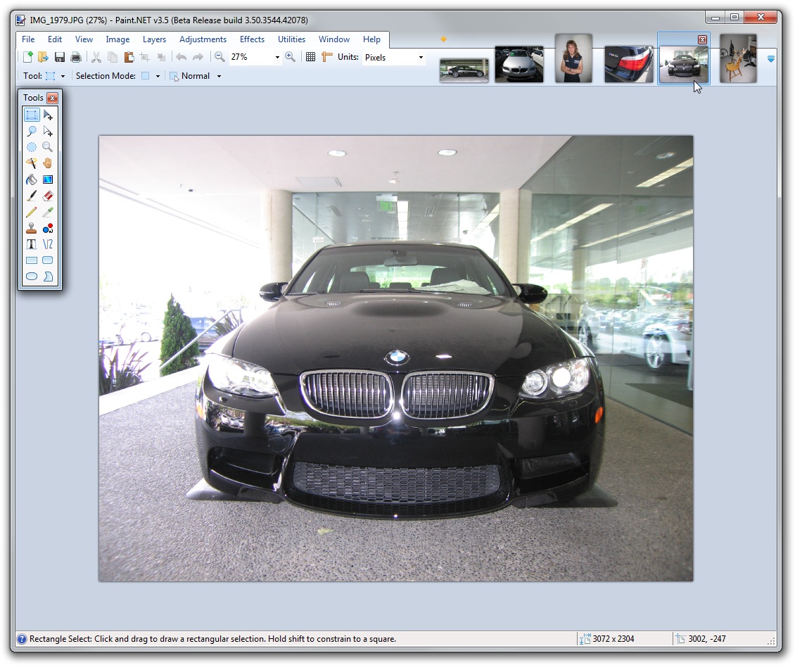
That pic is so shopped. I can tell by the pixels and by having seen alot of shops in my time. Also because it has no wheels.
🙂
I agree with rick, Harold. If you think its wrong that he is experimenting with a new API, then perhaps you should code something better 😉
I think if your in the mood for new stuff rick, can we see a prototype ribbon job? 😛
Kevin, huh? That’s a picture I took last summer at BMW Bellevue. It isn’t shopped. The angle does kinda make it look like it doesn’t have wheels, I never noticed that, huh.
@Dan: not just A new API, experimenting with DirectCompute would be very cool
But glass..?
Who says I haven’t experimented with DirectCompute? In any case it’s extremely rude to talk like you are. How would you like it if I came up to your project and said, “What? Why’re you doing that? It’s useless [to me]. You should’ve been doing this other thing instead.”
I don’t need a peanut gallery, so if you aren’t going to say something productive then don’t say anything at all. I will delete any further comments of that nature.
Dan, prototype ribbon? Not for awhile. I need to spend my time finishing and shipping v3.5, and then probably a v3.5.1 release to fix any small issues that weren’t caught.
Rick.. I have been using Paint.net for quite some time and I think you are doing one heck of a job. The “glass” feature..if you will.. looks great. The icons on the preview you are showing above look good. I do have one curiosity. The square red box that is placed over the top right corner of any picture that has the x in it… I think you know what I mean.. is there any chance of bringing back the “X” button that you have in the paint.net 3.30 versions? Just wondering.
Michael, no. I won’t be bringing it back. In my opinion, it’s very ugly compared to the new images I’m using.
Michael: That “close” icon on the image thumbnails is actually the same one that’s used in Windows 7 for thumbnails of running programs (where you can close them). So it’s actually a change to fit better into the visual style of the OS 🙂
See what you mean rick 😀
And yeah, the close thing was one of the first things i noticed, so much better than the old one! 😀
I was wondering if Jumplists will be a feature for those who have Win 7.
Please stop abusing glass 😉 While main window looks “acceptable”, the other dialogs (resize etc.) with glass look like crap. Is there an option to switch that thing off?
neruup, I rather like it actually. The majority of feedback is positive so I think it’s a keeper. There’s no option right now.
I was wondering if Jumplists will be a feature for those who have Win 7.
Hello,
the work you are doing on Paint.net is great,
I wanted to know if the next version will support for PDF files (perhaps to save the image to pdf)
ability to customize the brushes and maybe the help of schemes like in photoshop.
Really good job, keep so!
colino, Why on earth would PDF be added to Paint.NET? PDF is not an image format, it’s a document format completely separate from the type of stuff that Paint.NET does. You should get PDF authoring software.