It’s a very cool effect to extend glass into the non-client area, but it looks like GDI’s ClearType text rendering is obliterating the alpha channel. Thus, all text is essentially see-through. I don’t know of a way to tell the DWM to exclude certain areas from "glassification", you can essentially only give it 1 rectangle.
(Click for full size version)
So if I want to do something with glass it’ll take quite a bit of effort — maybe I’ll wait until a later milestone 🙂
Anyway let me know what you think. I do have plans for a visual "facelift" for Paint.NET v4. The first thing I’ve done is add a little gradient to the thumbnails in the image list at the top right (which took all of 5 seconds to implement, then 5 minutes to tweak the alpha values so it didn’t look wonky).

Neat effect, but I think this goes along with your previous post about distracting backgrounds; I’d prefer Paint.Net without transparency effects of any kind on the main window.
Looks very cool if you ask me. Although I think it might get in the way when trying to do some heavy graphic editing. Maybe make it optional? (I’m pretty sure you can sort out the font issue 😉
Right. It’s just an experiment at this point to see what can be done, and anything this bold would definitely be optional.
I’d probably start out with something less intrusive — like glass for the image/thumbnail list and toolbar.
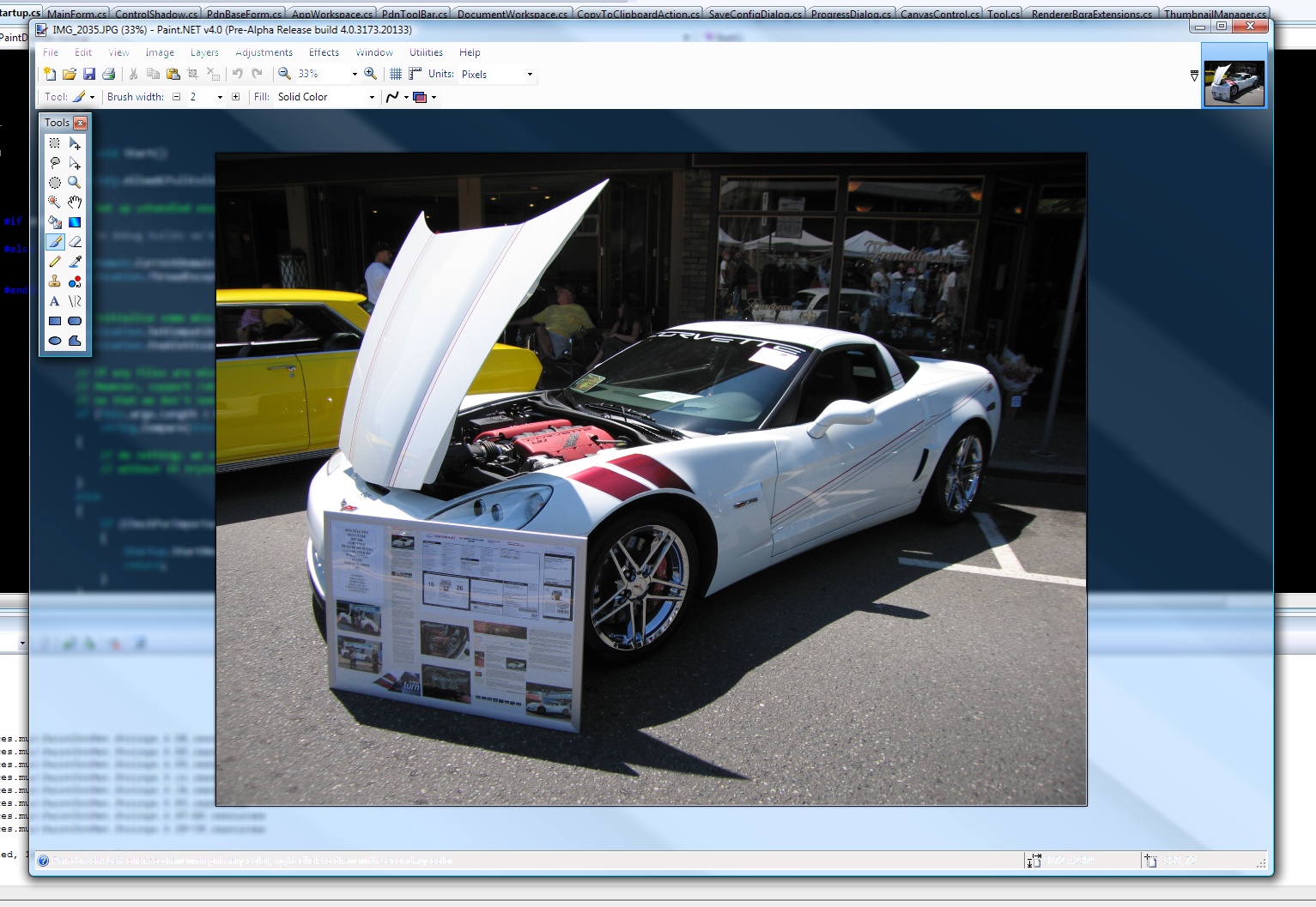
Looks nice. I like how you can see right through it. Would this work for XP users or just Vista? Anyway, It looks nice. Nice car too. Corvette?
Cody — Yup, it’s a ‘vette. Took the picture at the Kirkland Classic Car Show back in July.
You have to call DrawThemeTextEx to get the text nicely rendered.
Thomas — Yes, if you are drawing text on glass. In this case it’s not drawing text correctly on a simple opaque surface. It just spits out zeros into the alpha channel.
ok, so I have to ask – when do we get a ribbon ?
sometimes I find myself drowning in an ocean of menu’s and toolbars that I often loose focus on wtf i am looking for.
Personally, I think that’s hot, and would definitely turn it on as soon as it was an available option. I’ve never liked the “image on a gray desktop” idea, but there’s never been a great alternative, either.
Steven H, http://www.interact-sw.co.uk/iangblog/2006/05/26/ribboncargocult
mos — The trick, however, is if I can get a visual design that makes it functional *and* beautiful (err, “hot” :)), and not just a “hey look what I can do with 3 extra lines of code”-gimmick.
I gave up on aero glass after I found out that the only way to render text is to use GDI+ (and custom render controls that display text).
And WPF applications aren’t doing any better – text is really blurry due to some “limitations” (search for “wpf cleartype glass”).
Pent — Yeah it would take a lot of work to get the UI to render correctly as you would have to stab in and use WM_PRINT and then reset the alpha channel after the common controls rendered their text. But if something like the Vista CD burning wizard can do it, surely there must be some east way to fix it?
personally, the one thing i’d still like to see, is a “split” view, so you can have two views of one document… so you can have one zoomed way in for detailed editing, while having the other at 100%, so you can see what the overall image looks like.
I use paint.net mainly for web graphics and “icons”, and this would come in MAJORLY handy! 🙂
Either way, keep up the awesome and amazing work! CheerZ!
Personally, I don’t like it. Just give me the plain, old, gray background thankyouverymuch!
Dominoes — Don’t worry, I won’t remove that 🙂 This glass stuff is mostly an experiment, and if it makes it into v4 and onto the canvas area, it’ll definitely be optional.
As a design thing, you are probably better off reversing what you have right there, glass tends to work better with it being behind the tool and status bars than there document area. 😉
I remember running in to the text issue myself when playing with glass under WindowsForms though.. I forget how I fixed it..
This is a must have feature! 🙂
That is awesome. I totally want that!
Cool, but don’t forget to give option to disable it, and white text in statusbar on grey background is not looking good ;c)
A vera’nice! I’m also tending to think that the glass might be a nice touch behind the toolbars, though, rather than the canvas area. Maybe something like Firefox…
I also noticed that you increased the glass border of the Tools window. Or, now wait… no, you didn’t. Aha! I see it now, you’ve removed the inner border. An improvement—in my opinion. Makes it look simpler, cleaner.
Rick,
I couldn’t help but notice a new main menu item, ‘Utilities’.
Can you give us some insight as to what you have got planned?
Hot! Though a little distracting, and I could also notice you tricked out your Visual Studio!
Oh and I’ve been wondering how to implement that kind of transparency in my applications.
No, I didn’t do anything to Visual Studio. It’s just behind the Paint.NET window.
I would suggest changing the icons, like the one for the thumbnails. The icons for most of the tools also look rather out-fashioned and too simple.
linker: you do understand what the point of an icon is? As well as the inherent drawbacks of photorealistic or overly complex icons? Icons are _supposed_ to be simple and easily recognizable. Whether you would find the tools when presented with about 20 photos in 16×16 px² may be debatable.
Oooooh, this is opening up a whole bunch of possibilities. I don’t think I like the idea of extending the glass interface that far, but perhaps something like this?
Somewhat along the lines of what Google did with its Chrome browser.
Johannes Rösse, I DO understand what the main idea of an icon is, as I am a developer myself. I was telling that some of them can be more beautiful and nicely done. And by that I don’t mean more “complex and photorealistic”. I know Rick is not an artist but there are many cheap, even free icon packs on the net.
Stop arguing on my blog.
For the record, I have several icon packs that I pull from, and some new ones that I’m looking at for v4.
As for the Utilities menu, right now I’ve got Language and Updater stuff in there (it’s out of Help). I’m planning to put settings/preferences, and maybe it’ll be an extensibility point as well (“Batch Resize”, anyone?).
Sounds good, I’d have to say glass behind the top toolbar section. I don’t want to know what code you have to use for that… *shudders*
WPF has some interesting capabilities, but somebody said it was no good. I’ve only faked the glass border in WPF (and not that well either).
Keep up the good work mate!
Tsk.. Tsk… The Utilities menu should be renamed Tools for consistency with other apps.
Tsk tsk Calvin. There’s already a big featureset in this program referred to by “Tools”.
Love the effect. Aggree that it should be optional. I also would love to be able to dock the Tools, Layers, & Colours windows to the toolbar (and un-dock them at will) the way we can with OpenOffice for e.g. I know this appears to be an unpopular suggestion, but a ribbon option wouldn’t go astray either. As much as I don’t like Microsoft apps (but have to use them at Uni) I actually do like the tabbed ribbon of Office 2007. It would be more efficient for me (& many others). An M$ Office/OpenOffice style option to customize the toolbar/ribbon would be ace too. Aero Glass & ribbon options would go a long way to OS Integration for freaks like me who replace Paint with Paint.NET in their OS’. Keep up the good work. Love this programme. Oh, and a British English option too, if possible (which it is) – I’m not sure how long the weird localization option I’m using will remain compatible.
You want a ribbon? Search this blog for “Ribbon” since Rick will never add a ribbon
http://msdn.microsoft.com/en-us/magazine/cc163435.aspx
Is that any help with the text issue?
I actually really like the way that looks … I think that having it as a buried option somewhere would be nice. There probably would be times I’d want a grey background, but the glass really does look snazzy.
Hey just want to say nice program Rick. I use it to produce CG art for my friends and family and works out pretty nice.
#1 used feature: Layers!
Anyways good luck on V4 I hope it is everything you want it to be 🙂